FOIL.zone just moved to a new server after nine years on the old one. The forum is faster, fully up to date, and
a lot more secure. It also costs real money to run: about $65 a month for hosting and backups, paid out of pocket
and partly offset by the ads you see on the site.
Starting today there is a way to support the forum directly and skip the ads at the same time:
FOIL.zone Supporter
$20 per year, or $3 per month
No ads anywhere on the site while your membership is active
A Supporter title and a little star next to your name
Cancel any time from your profile’s Billing page
Sign up at FOIL.zone or via Subscribe in the menu. Payment is handled by Stripe; we never see your card details.
A few notes:
Members at trust level 3 and above, and the moderators, already browse ad-free. That won’t change; it is a thank-you for the time you put into this place.
Everyone else, including long-time regulars at trust level 2, now sees ads. The ads are what keep the site free for the thousands of people who read it without an account. If you would rather not see them, the Supporter membership is the way.
Supporter money goes to hosting first. If it ever covers more than that, I’ll say so here and put the rest into the forum.
Thanks for being part of this community. See you on the water.
On a mobile, the new site is completely unreadable unless you pay. I fear that any newcomers will not be willing to pay for something they don’t know it’s worth. I’m part of other similar forums using the same technology and they are more readable even with adverts. They tend to have some heavier sponsors so maybe that’s why they are working like that.
Two things changed at once with the new server: ads started showing to more members, and on phones Google was stacking its own ads on top of ours. I’ve cut mobile ads way back: no more ads injected between posts by Google, and ours appear far less often in long threads.
Also, members who actively contribute to the forum now browse without ads, whatever their trust level. You’re one of them, so you shouldn’t see any ads from now on. People who mainly read still see a few, that’s what keeps the site free for the thousands of visitors without an account. The Supporter membership stays as an option for anyone who’d rather go ad-free that way.
If anything still looks off on your phone, post a screenshot here and I’ll look at it.
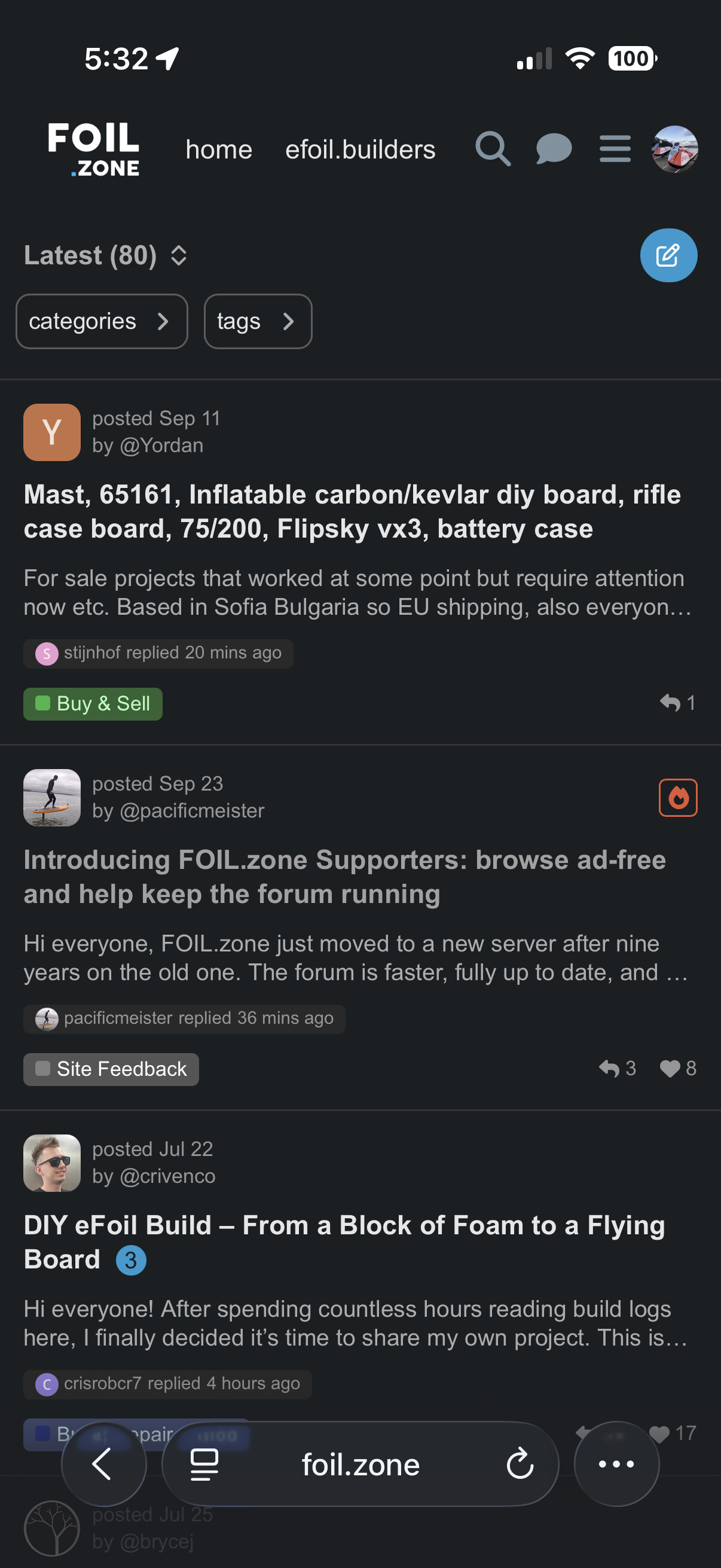
I am finding the new interface really hard to read too. I am not getting adverts but the size of each post is much larger and taking up too much space on the screen for me to be able to see the latest posts easily. I’m finding it difficult to use. Is there a setting I can change to revert back to the old view?
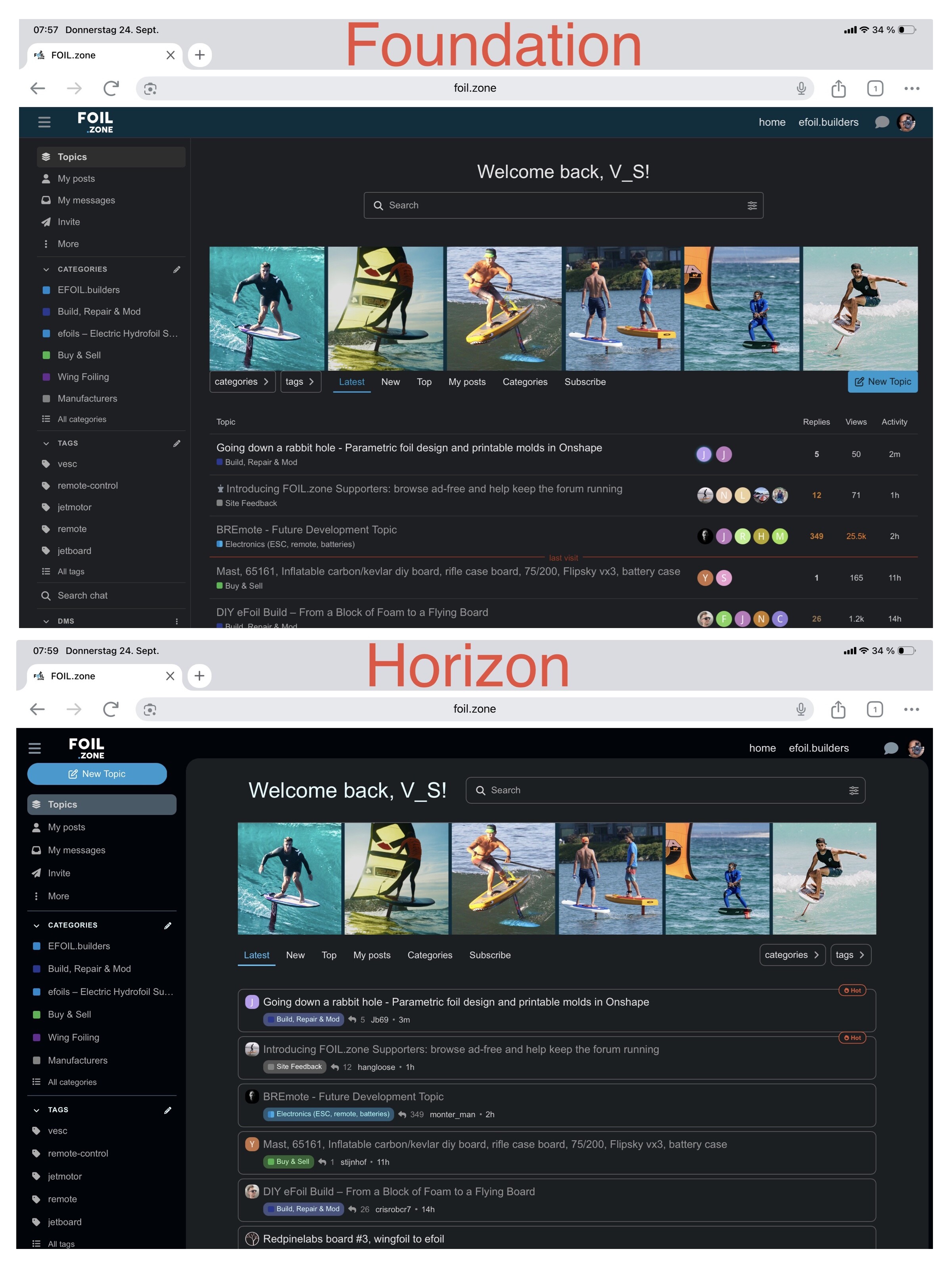
Thanks Strongarm, good call. The new theme showed an excerpt and extra details on every topic, which made the list slow to scan on a phone. I’ve switched it to compact cards: title, category, replies and last activity, so about twice as many topics fit on a screen. Have a look and tell me if it’s better. If you still prefer the old classic list, I can add it as a layout you can choose in your preferences.
nekitesurfing, please let me know if this changes things for you too. If not, can you post a screenshot and point out what changed and how it was different/better? Much appreciated.
Just visited the new site for the first time; the styling is very nice, but the interface now feels very large and hard to browse through–because of all the padding and vertical space (rather than horizontal space) used, far less topics now fit on a page. I wouldn’t mind having it a bit larger if I could see info like an excerpt to see what it is about without opening it first (ironically enough, reading above that appears to be exactly what it was when you originally switched the theme )
My ideal solution would be some customizability–many sites have a compact mode and a larger mode (and sometimes even an inbetween layout). Make the compact mode more compact by reducing wasted space and similar tweaks so one can scroll through titles as fast as I could on the old layout, and make the larger mode to be ideal for seeing what topics are about without opening it.
Having the option for the old classic view would be nice. I like that the different forums (progression, foil.zone etc) all are familiar when scrolling between them.
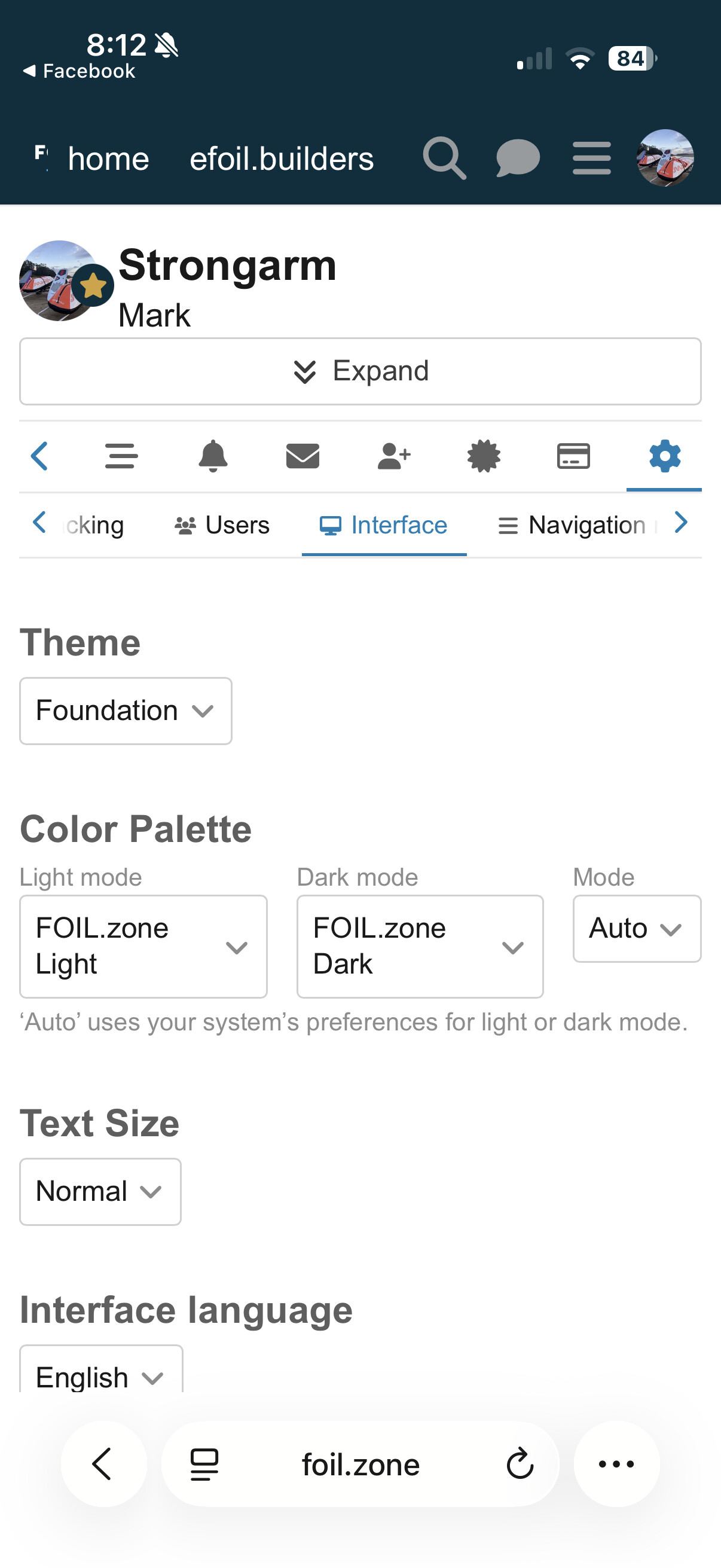
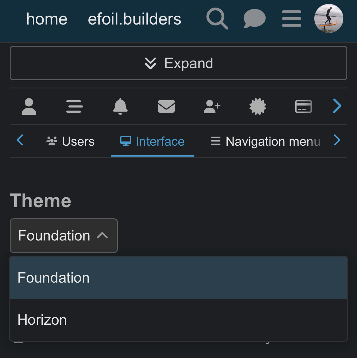
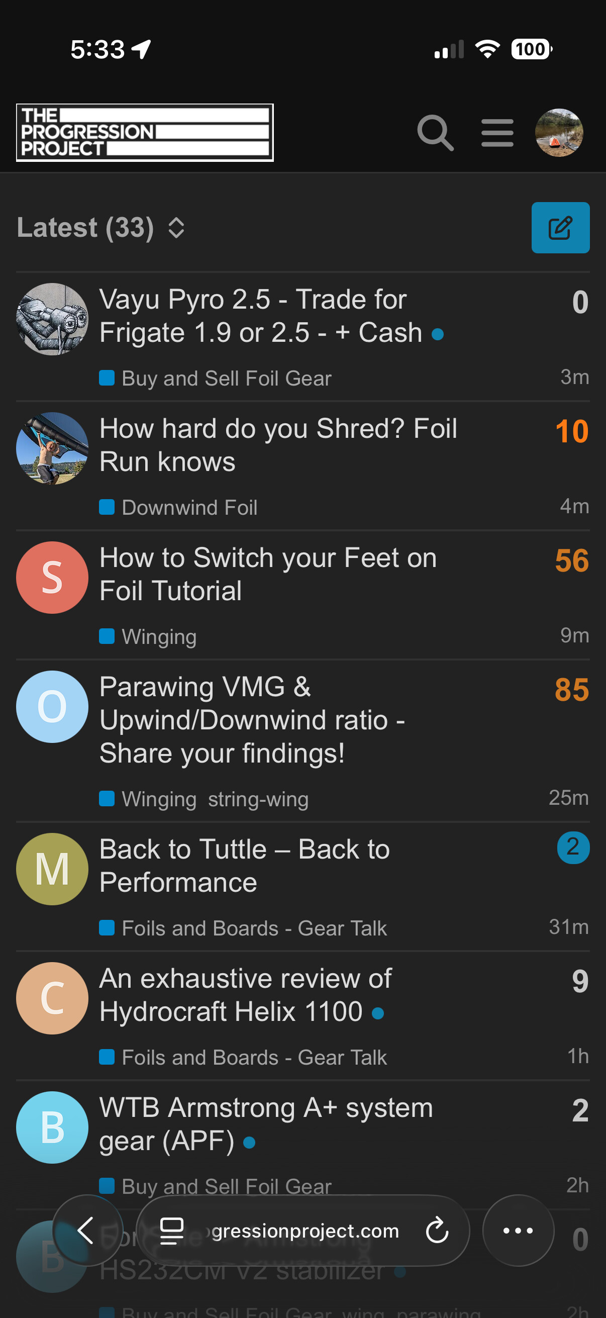
I added the old Foundation (Classic) theme back. Members can switch under their avatar → Preferences → Interface → Theme. It uses Discourse’s built-in classic list, the same dense table The Progression Project uses: one row per topic with replies, views and activity columns.
At first glance I was confused too and wanted the old view back. But I gave the new view another chance, and I actually think the new design is better—at least for me.
 )
)